strange... the black stripe is out of place, also the "bevel emboss" (outline volume) is unnecessary, the composition is interesting. The question is, what is 2005? Have you Photoshopped anything before?
Everything is on point! An autobiography page. You need to look deeper! The plot was born literally yesterday. To each their own!
I was very touched by this work! The sadness and the dark streak that divided life into "before" and "after" are expressed in a very touching and unusual way. A very emotional and tender work. A photographic memory of a loved one...
This isn't a self-portrait either. The emphasis is equally on both faces. In this case, the only interesting things are the idea and composition...the execution is mediocre. The font is terrible. Even "arial" would have looked more interesting. The contour extrusion is also bad. It's immediately obvious that this person is a professional in photography, not design.
DenArt, I think this is a true self-portrait, a person's destiny, and the emphasis here is one, and quite clearly legible. And the font has nothing to do with it.
Irinny, it's all about that. From start to finish. It's honestly a shame that there are 10-15 truly interesting SELF-PORTRAITS somewhere in the second half... and ahead of them are "famous people with points," who are automatically given marks, and 40% of the photos are just not up to par as competition entries (SELF-PORTRAITS). I would suggest giving everyone links to the top 5 works at the end of the competition. I'm sure the situation will change "a little." p.s. At least the everyday photo of the "ballroom" photographer with a shashlik has disappeared... there's progress! :)))
This is deeply personal, and therefore indelicate comments hurt the author. There's no need to ask questions when a photograph has a title like that... The subject is interesting, the analogies are clear, the symbols are well-placed, and the work is meticulous. All that remains is to add: hang in there, friend, life is like that...
Lara Gramatchikova, your reasoning is inappropriate. The author wanted criticism, since he entered a photograph into the competition. And to push him forward because of the plot is sympathetic... it's unfair to the others and, I think, unpleasant for him. I'm not arguing "indelicately" - I'm not touching on the topic (which, by the way, was very IMPRESSIVE), but criticizing the execution. The first - 9, the second - 5
Thanks everyone! If the work touched people with different perspectives on photography, it means it was a success to some extent, and there's still room for improvement.
I've returned once again to see something that touched me deeply! So much so that I was so overwhelmed that I forgot to rate it last time. I've made amends. Some people "can't see the forest for the trees." Either they haven't experienced it, or they're incapable of understanding the depth of the concept. Thanks for the work!

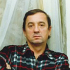

In this case, the only interesting things are the idea and composition...the execution is mediocre. The font is terrible. Even "arial" would have looked more interesting. The contour extrusion is also bad. It's immediately obvious that this person is a professional in photography, not design.
It's honestly a shame that there are 10-15 truly interesting SELF-PORTRAITS somewhere in the second half... and ahead of them are "famous people with points," who are automatically given marks, and 40% of the photos are just not up to par as competition entries (SELF-PORTRAITS).
I would suggest giving everyone links to the top 5 works at the end of the competition. I'm sure the situation will change "a little."
p.s.
At least the everyday photo of the "ballroom" photographer with a shashlik has disappeared... there's progress! :)))
Perhaps
Thanks!
I wish your tree rings to multiply!!!
Good work!
Some people "can't see the forest for the trees." Either they haven't experienced it, or they're incapable of understanding the depth of the concept. Thanks for the work!
I'm not recommending this; that's not why you did this work, as I understand it.
Please accept my sincere congratulations!
It's just a shame the topic is so sad.