Mirosha, I agree, that's good too. But everyone has their own vision... I wanted to frame it that way too, but my idea was to include a bit of the city...
Vladus, I agree... they're similar But I'll say one thing: I didn't rip off Arthur's idea And in general, I don't really like putting copyrights on photos...
Vladus, Well, I'm not saying anything It's just that some people might say I ripped it off. (That's not you.) I wrote it in the comment so everyone could see my sincere confession. :)))))) Thank you for appreciating the work))
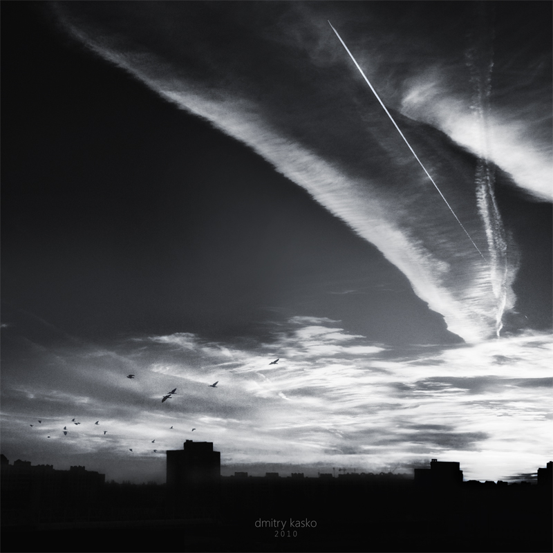
Interesting work! The bottom is a bit confusing (it's blurred in the plan, and it's unclear); I'd like to see sharp outlines of the buildings. P.S. ...and the logo shouldn't be yellow here, but rather match the color of the card.


Ver recorte
I like your version better too!
It's just that the field of activity is vast, so I gave myself the slack to "cut it out."
And in general, I don't really like putting copyrights on photos...
Thank you for appreciating the work))
The bottom is a bit confusing (it's blurred in the plan, and it's unclear); I'd like to see sharp outlines of the buildings.
P.S. ...and the logo shouldn't be yellow here, but rather match the color of the card.